Learn how to calculate the Pearson correlation coefficient in Excel using the CORREL function and Data Analysis Toolpak. This step-by-step guide shows you how to measure the correlation between two variables, interpret results, and check assumptions.
The Pearson correlation coefficient measures the strength and direction of the linear relationship between two continuous variables. Excel's built-in CORREL function makes it easy to calculate correlation coefficients quickly, whether you're analyzing advertising spend vs revenue, test scores vs study hours, or any two related variables.
Download the practice dataset from the sidebar (password: uedufy) and follow along with the examples.
What is Pearson correlation coefficient?
Let's say you own a clothing store and want to see if there is a relationship between how much you spend on advertising and how much money you make. This is where the Pearson correlation coefficient comes in handy!
On the other hand, if the coefficient is close to -1, that means that as you spend more on advertising, your income is likely to decrease. And if the coefficient is close to 0, there's no real relationship between advertising and revenue.
You looked at your data, and the Pearson correlation coefficient was 0.8. This means there's a strong positive relationship between Advertising and Revenue: the more you spend on advertising, the more money you make! But don't get too excited just yet. Other factors can affect income too. Knowing the Pearson correlation coefficient is just one piece of the puzzle, but an important metric to consider.
The Pearson correlation coefficient measures the strength of the relationship between two things, in this case, advertising and revenue. If the coefficient is close to 1, that means that as you spend more on advertising, you'll likely see an increase in revenue.
Where:
- r is the correlation coefficient
- xi represents values of the x-variable in a sample
- x̄ is the mean of the values of the x-variable
- yi represents values of the y-variable in a sample
- ȳ is the mean of the values of the y-variable
Pearson Correlation Assumptions
Before calculating Pearson correlation coefficient in Excel, verify your data meets these assumptions:
1. Continuous Variables
Both variables should be measured on a continuous scale (interval or ratio level). Pearson correlation is NOT appropriate for categorical or ordinal data.
Examples of continuous variables: height, weight, temperature, test scores, revenue, time
2. Linearity
The relationship between the two variables should be linear. This means that as one variable increases, the other variable increases (or decreases) at a constant rate.
How to check in Excel: Create a scatter plot of your data. If the points roughly form a straight line pattern (not a curve), the linearity assumption is met.
3. Independence of Observations
Each observation should be independent, meaning that the value of one observation should not influence or be related to the value of another observation.
Example: Measuring the same person multiple times violates independence. Each data point should come from a different subject or measurement occasion.
4. Bivariate Normality
For accurate significance testing, both variables should follow a bivariate normal distribution. However, Pearson correlation is fairly robust to violations of normality for larger sample sizes (n > 30).
How to check in Excel: Create histograms for each variable to visually assess normality. For samples smaller than 30, consider using normality tests.
What if assumptions are violated?
If your data violates these assumptions (especially linearity or normality), consider using Spearman's rank correlation coefficient instead, which is a non-parametric alternative that doesn't require these strict assumptions.
Method 1: Calculate correlation coefficient in Excel using CORREL function
Let's go back to our clothing store example and learn how to calculate Pearson correlation coefficient in Excel to find out if there is a relationship between how much we spend on advertising and how much money we make.
1. Prepare your data: Organize your data into two columns, with one column representing each of the two variables you want to analyze. In my dataset, the two variables we want to check if they are correlated are Advertising and Revenue.
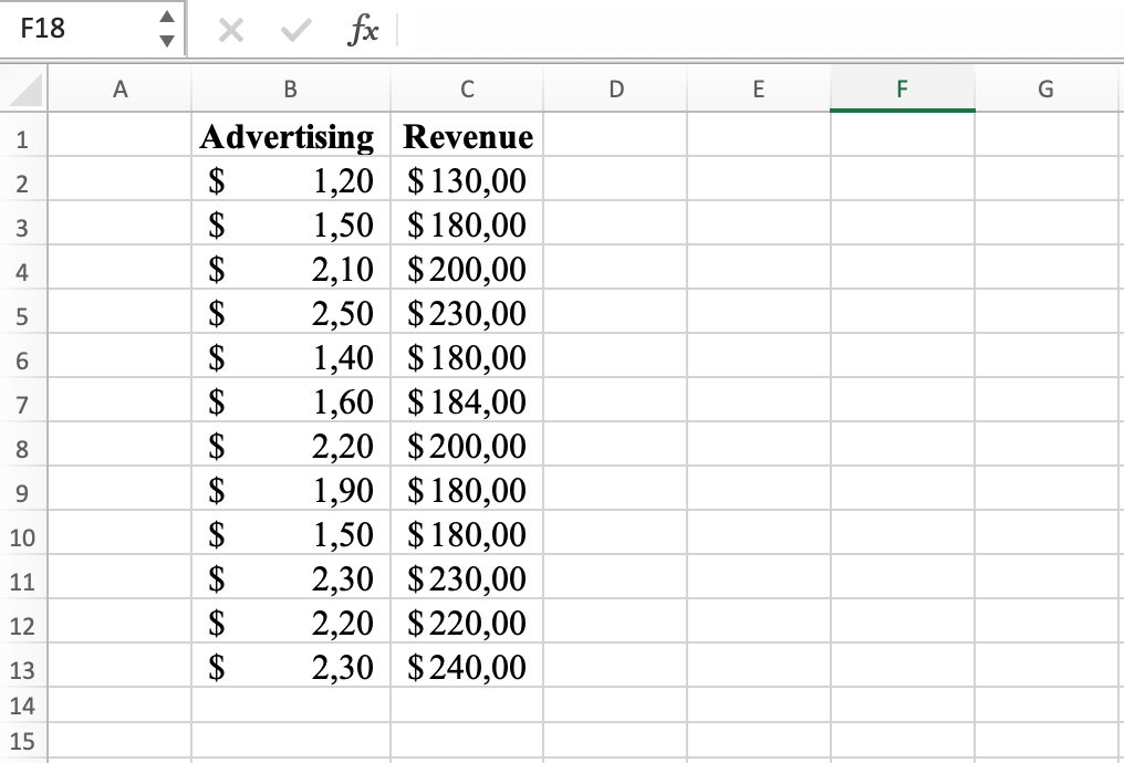 Example of two variables for correlation coefficient calculation in Excel
2. Select a cell: Choose a cell in your worksheet where you would like to display the result of the Pearson correlation coefficient.
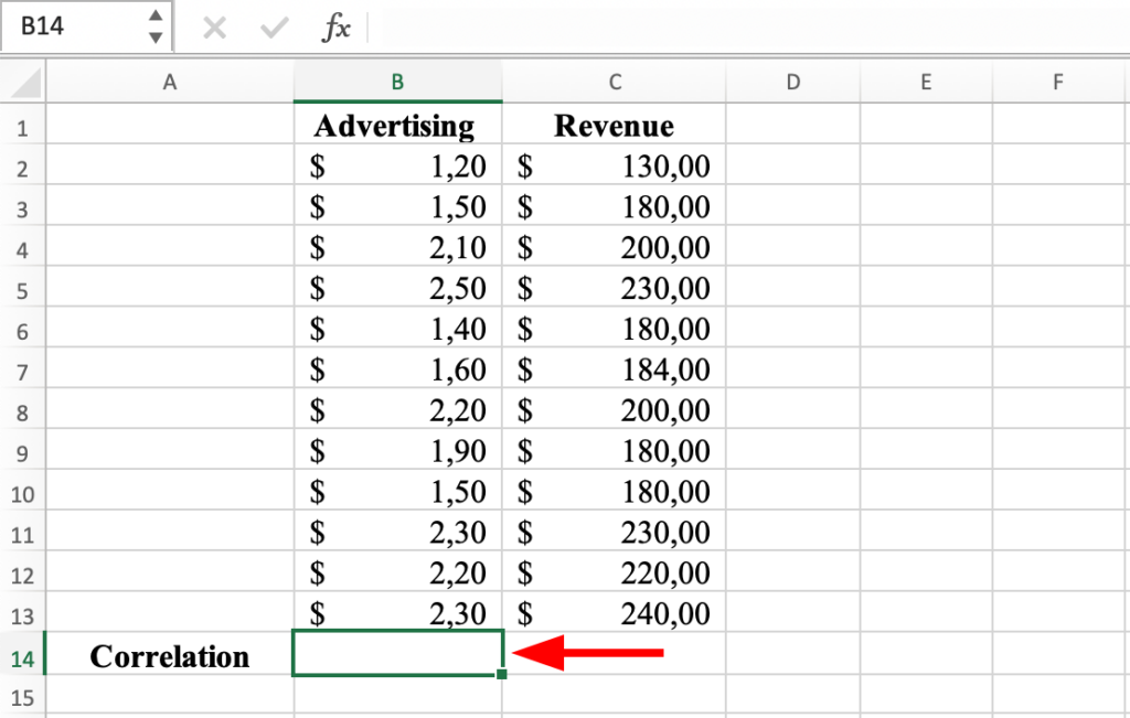 Select a cell in the worksheet for the correlation result
3. Enter the correlation function: Type "=CORREL(" followed by the range of the first column of data, a comma, and the range of the second column of data, and close the parentheses. For example, if your data is in columns B and C (like in the capture below), the correlation function would look like this: =CORREL(B2:B13, C2:C13).
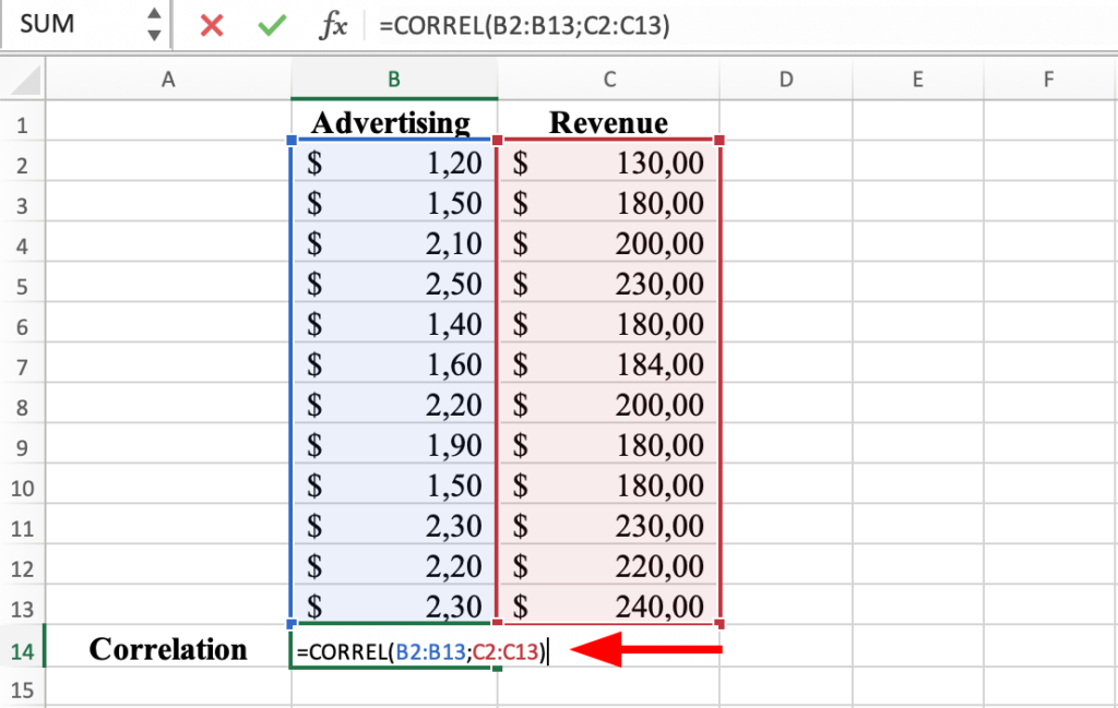 CORREL function in Excel
4. Calculate the result: Press the ENTER key to calculate the Pearson correlation coefficient. The result will be displayed in the selected cell. The correlation coefficient between Advertising and Revenue in our dataset is 0.9.
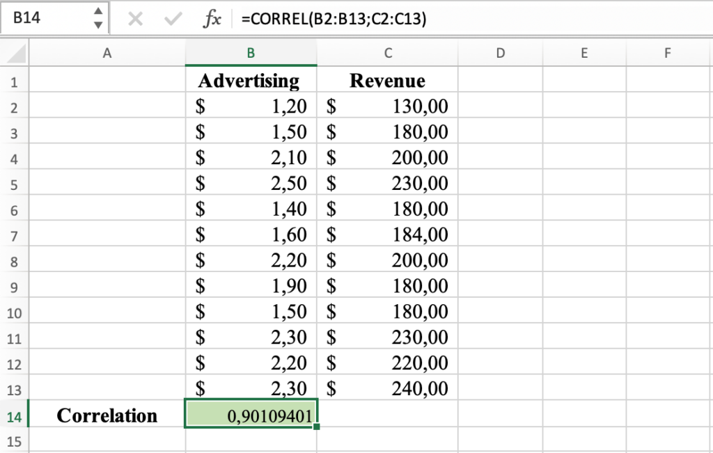 Pearson correlation coefficient result for the selected variables
Method 2: Calculate correlation coefficient using Analysis Tool in Excel
Here is another way to calculate the correlation between two variables in Excel using the Data Analysis Toolpak.
1. Prepare your data: Make sure your data is organized in two columns, each column representing a variable (same as we did before).
2. Install Data Analysis tool in Excel: if you don't see the Data Analysis icon in your Data tab in Excel, you should install the Data Analysis Toolpak first.
 Data Analysis location in Excel
3. Launch the Data Analysis tool: From the Data tab, click on Data Analysis, and select Correlation.
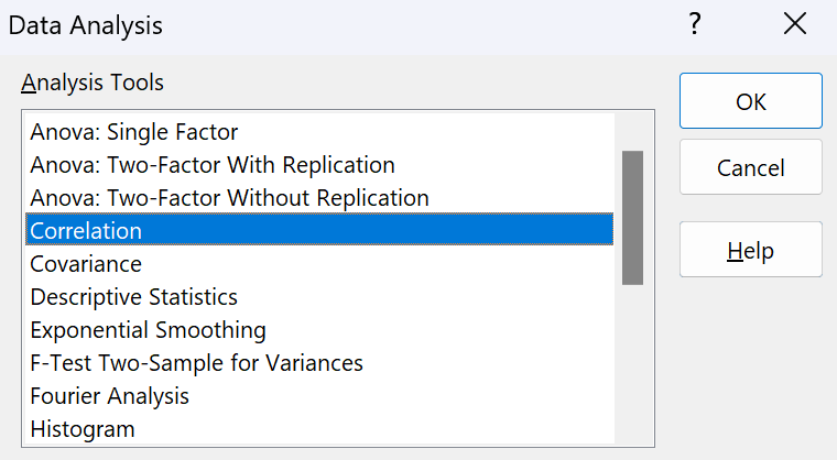 Data Analysis - Correlation
4. Select the data: In the Data Analysis dialog box, select the input range, which is the range of the two columns of data. If you included the column labels in your selection (Advertising and Revenue), check the Labels in First Row checkbox.
NOTE: In the "Output Options" section, you can also choose where you want the result to be displayed, either in a new worksheet or in a range of cells. Let's leave the default setting for now.
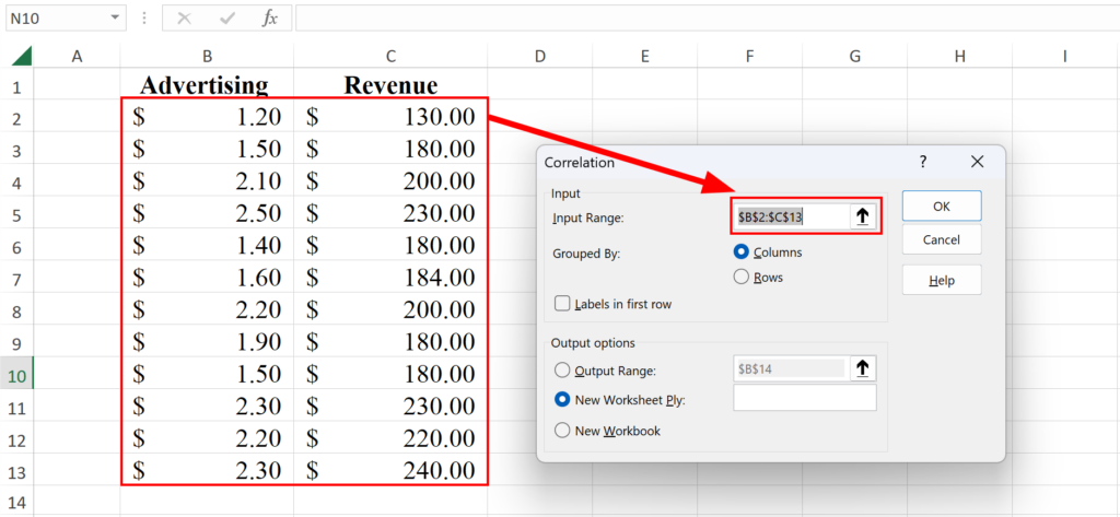 Select the range of values for correlation
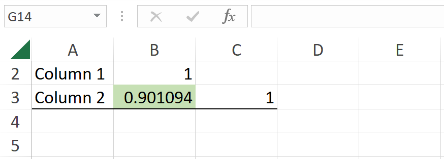
5. Run the analysis: Click on OK to compute. The result of the Pearson correlation coefficient will be displayed in the output location you selected. As expected, for the same data set, the coefficient is the same: 0.9.
 Pearson correlation coefficient result in Excel
How to Interpret Pearson Correlation Results
The Pearson correlation coefficient (r) will always be a value between -1 and 1. Here's how to interpret the results in Excel:
Understanding Correlation Values
Coefficient Value:
- r = 1: Perfect positive correlation (as one variable increases, the other increases proportionally)
- r = -1: Perfect negative correlation (as one variable increases, the other decreases proportionally)
- r = 0: No linear correlation (no linear relationship between variables)
Direction:
- Positive correlation (0 to 1): Both variables move in the same direction
- Negative correlation (0 to -1): Variables move in opposite directions
Correlation Strength Interpretation
Use these guidelines to interpret the strength of your Pearson correlation coefficient:
| Correlation Value | Strength | Interpretation |
|---|---|---|
| 0.9 to 1.0 (or -0.9 to -1.0) | Very strong | Variables are highly correlated |
| 0.7 to 0.9 (or -0.7 to -0.9) | Strong | Strong relationship exists |
| 0.4 to 0.7 (or -0.4 to -0.7) | Moderate | Moderate relationship |
| 0.1 to 0.4 (or -0.1 to -0.4) | Weak | Weak relationship |
| 0 to 0.1 (or 0 to -0.1) | None | No meaningful correlation |
Example Interpretation
In our example, the correlation coefficient of r = 0.9 indicates a very strong positive correlation between Advertising and Revenue variables.
What this means:
- As advertising spending increases by 1 unit, revenue tends to increase at a very consistent rate
- 81% of the variance in revenue can be explained by advertising spending (calculated as r² = 0.9² = 0.81)
- This is a very strong relationship, but it does not prove causality
Important: Correlation vs Causation
Critical reminder: A high Pearson correlation coefficient does NOT mean one variable causes the other. It only shows they tend to change together.
Why this matters:
- Correlation shows association, not causation
- A third variable might be influencing both variables
- The relationship might be coincidental
- Reverse causation might exist (B causes A, not A causes B)
To establish causation, you need experimental research designs or additional statistical methods such as regression analysis.
Pearson vs Spearman Correlation: Which to Use?
When analyzing correlation in Excel, you might wonder whether to use Pearson or Spearman correlation. Here's how to choose the right method:
Pearson Correlation Coefficient
Use Pearson when:
- Both variables are continuous (interval or ratio scale)
- The relationship between variables is linear
- Data is approximately normally distributed
- No significant outliers are present
Advantages:
- More powerful statistical test (better at detecting true correlations)
- Widely recognized and commonly reported in research
- Easy to calculate in Excel using CORREL function
Disadvantages:
- Sensitive to outliers
- Requires assumptions (linearity, normality)
- Only detects linear relationships
Spearman Correlation Coefficient
Use Spearman when:
- Variables are ordinal (ranked data)
- The relationship is monotonic but not necessarily linear
- Data contains outliers
- Data is not normally distributed
Advantages:
- Non-parametric (no distribution assumptions required)
- Robust to outliers
- Works with ranked/ordinal data
- Detects monotonic relationships (not just linear)
Disadvantages:
- Less powerful than Pearson when assumptions are met
- More complex to calculate in Excel (requires ranking data first)
- May miss some relationship nuances
Quick Decision Guide
Choose Pearson correlation if:
- Your data is continuous and normally distributed
- The scatter plot shows a roughly linear pattern
- You have no extreme outliers
Choose Spearman correlation if:
- Your data is ordinal/ranked
- The scatter plot shows a curved or non-linear pattern
- You have significant outliers
- Your data violates normality assumptions
Example: If you're correlating test scores (continuous, normally distributed) with study hours (continuous), use Pearson. If you're correlating customer satisfaction rankings (ordinal: 1-5 stars) with product quality ratings, use Spearman.
For most Excel users working with continuous, normally distributed data, Pearson correlation is the appropriate choice.
Frequently Asked Questions
Wrapping Up
The Pearson correlation coefficient is a useful tool for understanding the relationship between two variables, and it is easy to calculate in Excel using either the Data Analysis Toolpak or the CORREL function.